NamingBrandingKey visualLaunch campaignPrint and outdoorDigital
The challenge
Azalea is Huayang’s new project of one and a half storey terrace homes. Like Ellington 23, it needed everything before launch: a name, a brand, a key visual and a full set of launch materials.
Property advertising in Malaysia runs in Bahasa Malaysia, so the brand and every material had to work in BM first. It still had to feel warm, modern and well made, the kind of place a family can picture living in.
Families choose a home together, so the brand has to speak their language.
The strategy
A name with warmth
We started with the name. Azalea is a flower: soft, welcoming and easy for any buyer to say. The logo turns it into a simple line mark in warm terracotta.
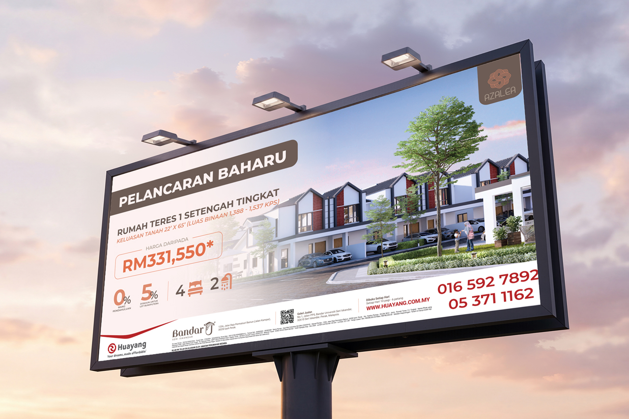
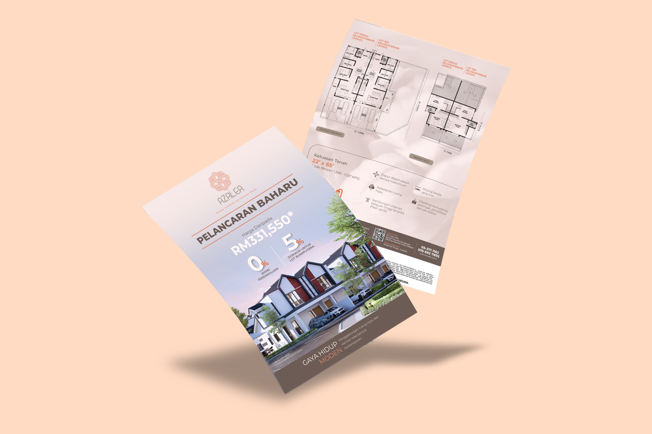
Then the campaign. One key visual in soft blush, warm brown and terracotta puts the home front and centre, with the price and launch offers clear at a glance. Every piece is written in Bahasa Malaysia.
Naming and brand
The Azalea name, a flower line logo, and a blush, brown and terracotta palette that feels like home.
Key visual and launch materials
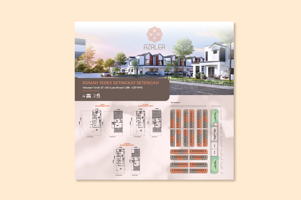
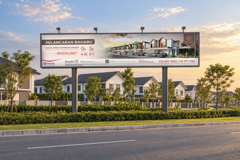
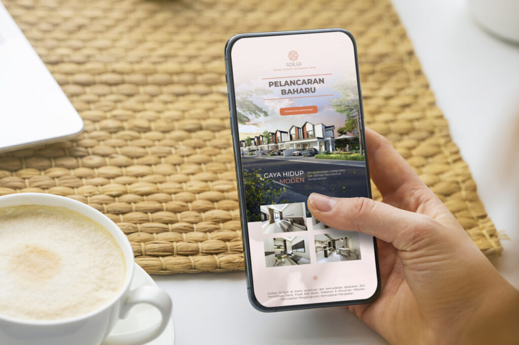
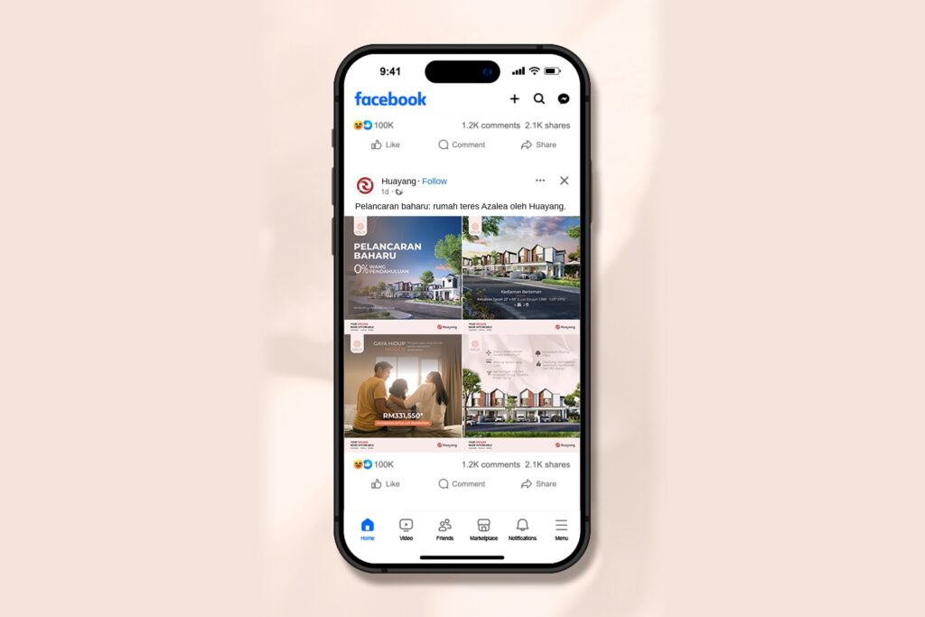
One key visual in Bahasa Malaysia, carried across the billboard, sales gallery, site plan, brochure, flyers, press ad, buntings, banners, EDM, web, Facebook and WhatsApp.
Launch materials
The rollout
One look, one clear message
From the roadside billboard to the sales gallery, a press ad and a WhatsApp message, buyers met the same look and the same clear message in Bahasa Malaysia.
That made Azalea easy to recognise, and easy to ask about.