StrategyBrand refreshPackagingCampaign and contentWebsite design and developmentFestive and promotional campaignsDigital campaignsMarketing materials
The challenge
Ngan Yin is one of Malaysia’s most recognised groundnut brands. Eighty years old, trusted by generations, in homes across the country. But heritage cuts both ways.
The brand was loved, but it was starting to feel like it belonged to a grandparents’ generation. Younger shoppers were reaching for newer, more design-forward snacks on the same shelf. And the Cap Tangan mark, a literal hand, carried decades of meaning at home without travelling beyond it.
The question was how to modernise without throwing away eighty years of recognition.
The strategy
From hand to thumbs up
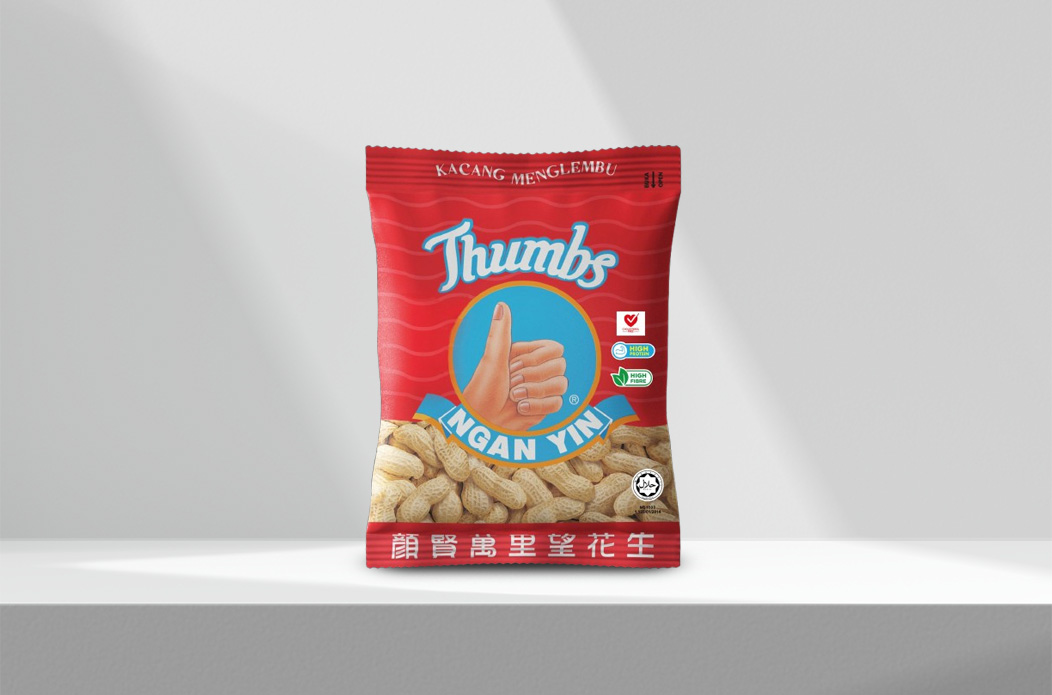
We started with the mark. Cap Tangan was the brand’s biggest asset and its biggest barrier, so we kept it and turned it. The hand became a thumbs up: same gesture, same warmth, and a mark that reads in any market, in any language, on any shelf.
Packaging
Rebuilt cleaner and sharper, still unmistakably Ngan Yin at a glance.
Photography and video
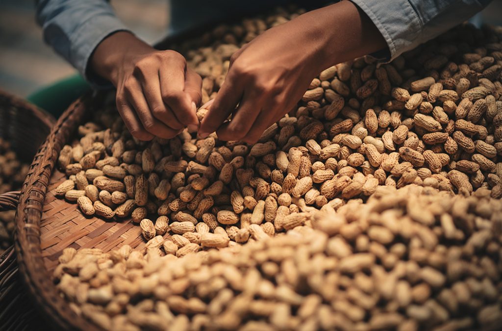
A fresh visual library built for how younger shoppers actually browse.
Marketing materials
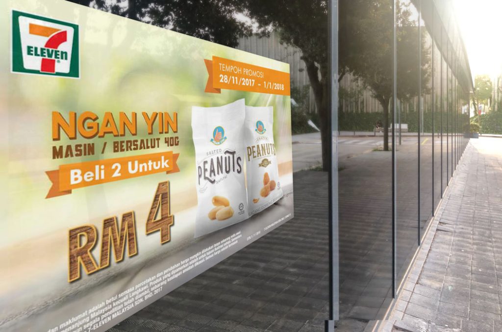
A full kit so the refreshed brand shows up the same way everywhere.
Website
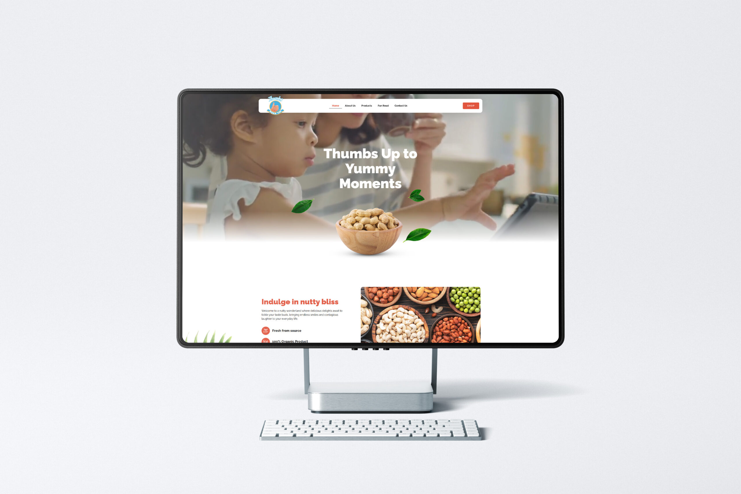
We designed and built Ngan Yin’s website and linked it to their existing e-store, so shoppers can go from the brand story to buying in a few clicks.
Launching the change
A campaign built to say one thing: same brand you know, ready for what comes next. The work was designed for digital-first viewing from the start, which is what made the next part possible. Since then, we have kept working on Ngan Yin’s festive, promotional and digital campaigns.
The system around it
In motion
The films
Eighty Years of Cap Tangan
5 Videos
The outcome
Shelves, and now screens
The refreshed Ngan Yin went onto shelves nationwide, from neighbourhood kedai runcit to the supermarket chains.
It also opened a channel the brand had never fully used. With packaging and content built for digital-first viewing, Ngan Yin now sells through Shopee, Lazada, TikTok Shop and its own web store, reaching a generation that shops by scrolling rather than by walking the aisles. The new mark also opened new conversations with international buyers.
years of recognition, kept.
0
online sales channels: Shopee, Lazada, TikTok Shop and its own web store.