NamingBrandingKey visualLaunch campaignPrint and outdoorDigital
The challenge
Ellington 23 is Huayang’s new development of 2 and 3 storey shop offices. It launched into a crowded market, with nearby projects selling the same kind of shop office to the same buyers and investors.
From the road, most of them look alike. Huayang needed Ellington 23 to stand apart: more vibrant, more modern, and clearly a step above the projects around it.
When the shop offices nearby look the same, the brand has to show the difference first.
The strategy
A name and a look a step above
We started with the name. Ellington 23 gives the project an English name that sounds modern and confident, and sits easily beside its Chinese name.
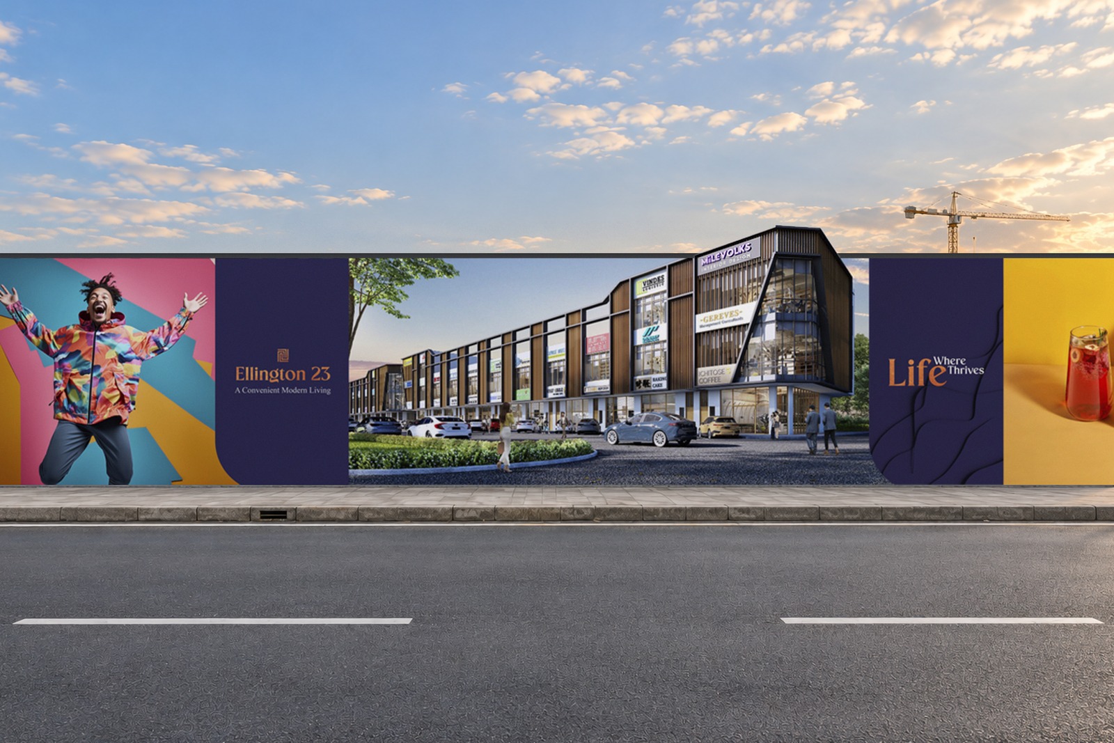
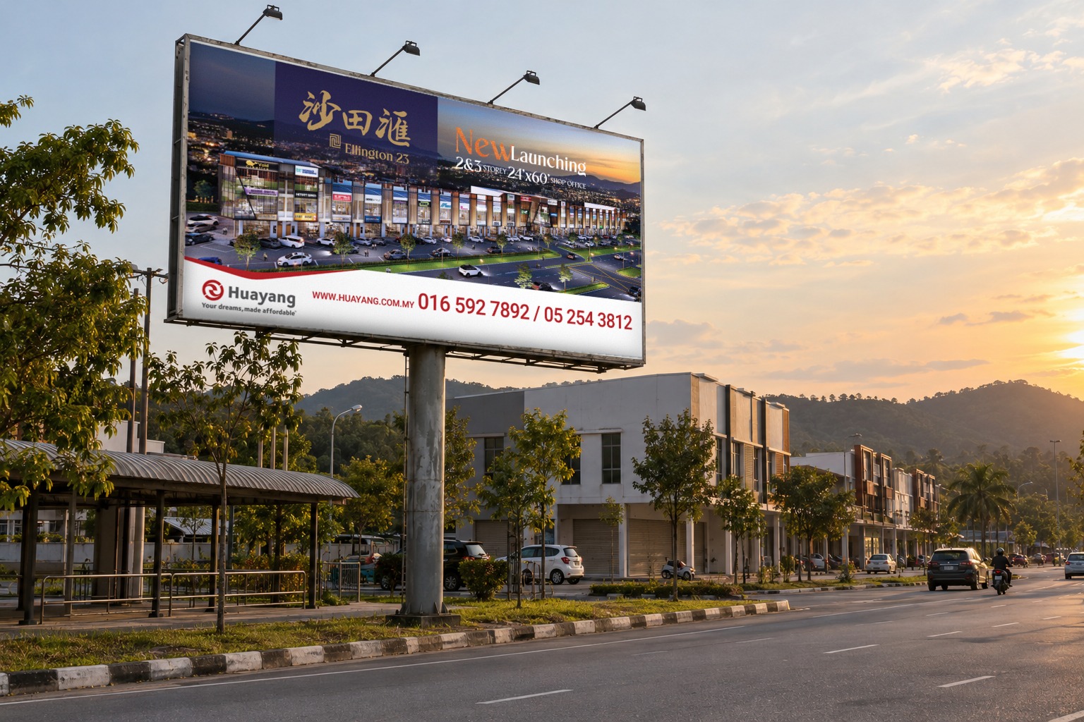
Then the brand. We built the identity and key visual on deep navy and warm gold, with the development shown at dusk: shopfronts lit, streets busy. It reads as a place that is already alive, not a plot of land waiting to be sold.
Naming and brand
The Ellington 23 name, the project logo, and a navy, gold and warm orange look made to feel a level above the market.
Key visual and launch materials
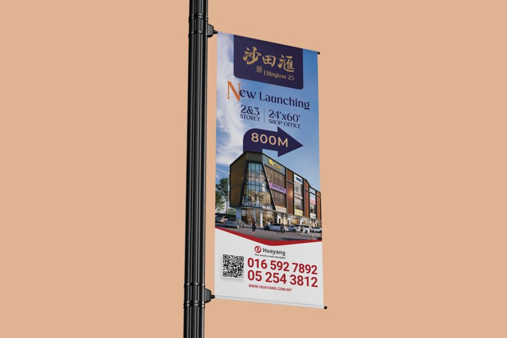
One key visual, carried across the site hoarding, roadside billboard, street and roll-up buntings, brochure, flyers, EDM, web banners and Facebook.
Out in the market
The rollout
One look, everywhere buyers pass
The launch ran wherever buyers met it: at the site, on the road, in their hands and online.
One look across all of it made Ellington 23 easy to recognise and easy to remember.