NamingBrandingKey visualLaunch campaignSales galleryPrint and outdoorDigital
The challenge
Loft 26 is a 26 storey condominium by Luxe Properties, made up of loft homes laid out over two levels. It was the first condominium loft in the state, so most buyers had never seen this kind of home before.
The launch had to explain a new type of home quickly, and make it feel modern and worth the step up, from the first billboard on the road to the sales gallery.
When buyers have never seen a home like this, the brand has to show them first.
The strategy
A name and a look a level above
We started with the name. Loft 26 says what the home is and how high the tower goes, in one short name that is easy to remember in any language.
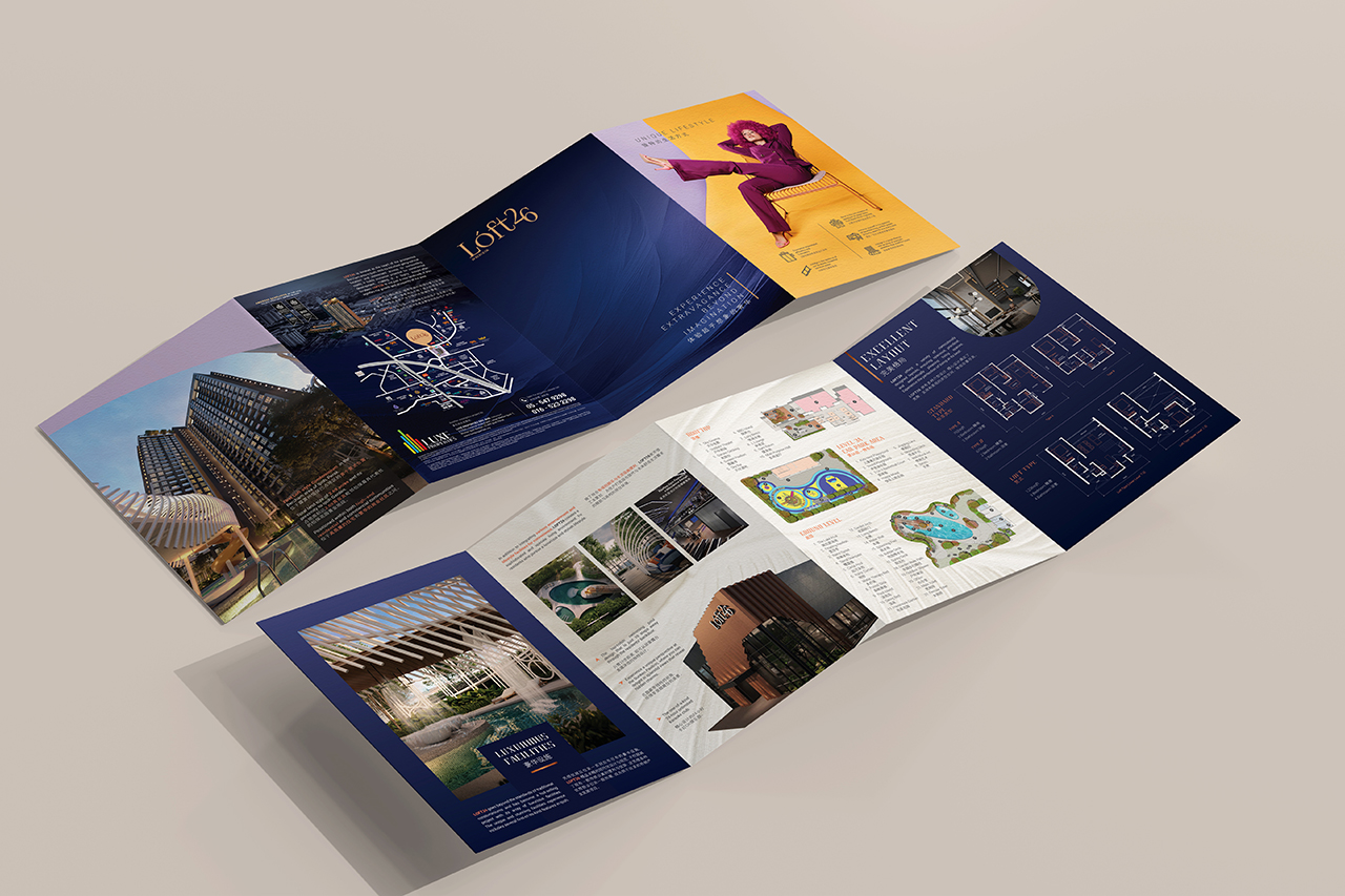
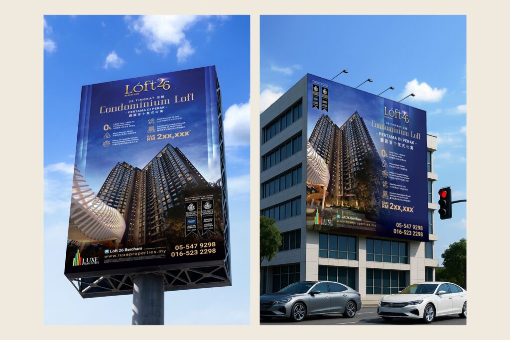
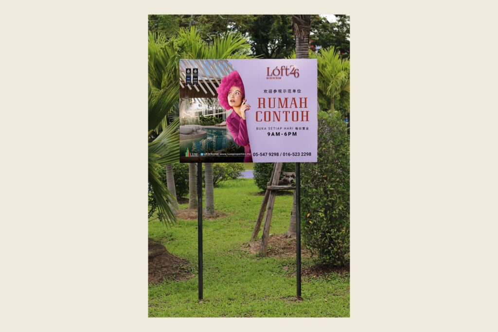
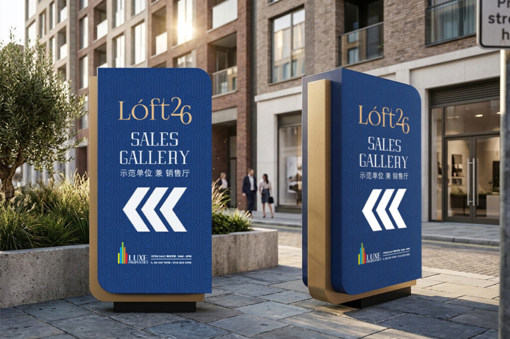
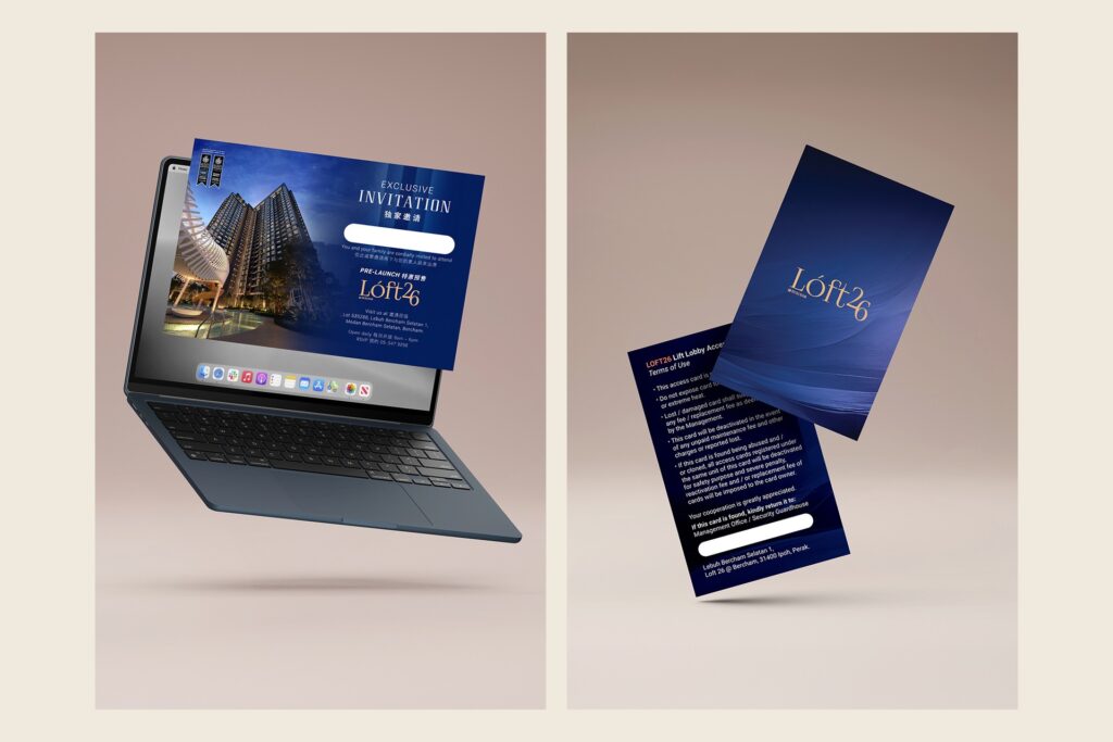
Then the brand. Deep night blue with warm gold and a soft lilac gives it a calm, premium feel. One key visual carried the launch across billboards, buntings, signage, the brochure and the e-invitation, and right into the sales gallery, the staff uniform and the residents’ access card.
Naming and brand
The Loft 26 name and logo, and a night blue, gold and lilac look made to feel a level above.
Key visual and launch materials
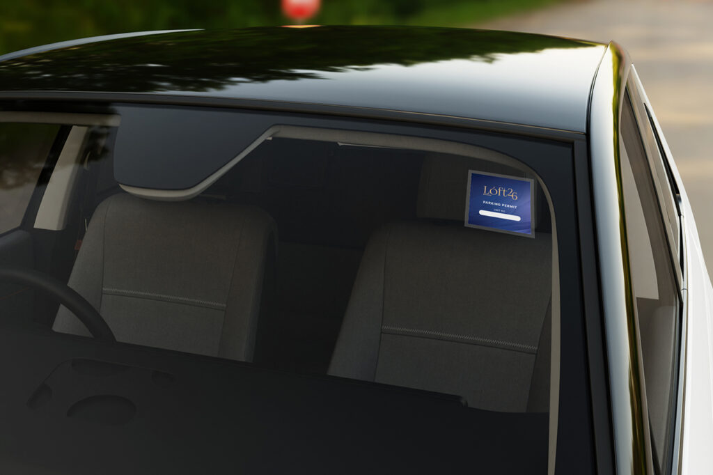
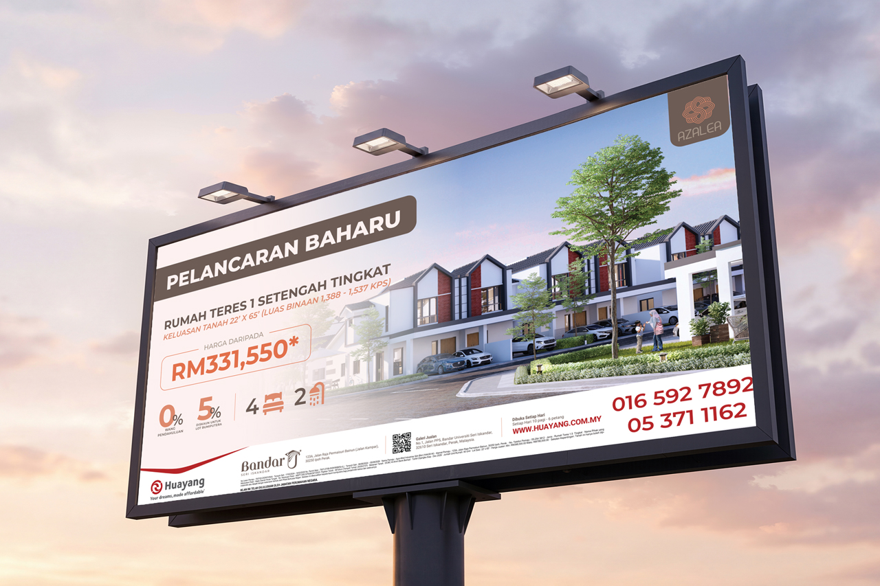
One key visual across billboards, buntings, signage, pillar wraps, the brochure, folder, e-invitation, sales gallery boards, staff uniform, access card and car sticker.
From road to residence
The rollout
From the roadside to the front door
Buyers met Loft 26 on the road, in their inbox and in the sales gallery, and the same look carried on to the access card and car sticker residents use every day.
One look, from the first billboard to the front door.