In September, we sent off the last files for a patient feedback campaign with IHH Malaysia. It covers all five of its hospital brands in Malaysia: Gleneagles Hospitals, Island Hospital, Pantai Hospitals, Prince Court Medical Centre and Timberland Medical Centre.
A survey that arrives the next day
IHH Malaysia asks patients to rate their visit with a short survey. It arrives on WhatsApp the day after they go home. The artwork’s job was to tell people about it while they were still at the hospital, so the message would feel expected when it came, and not like spam from a number they didn’t know.
One message for the whole group
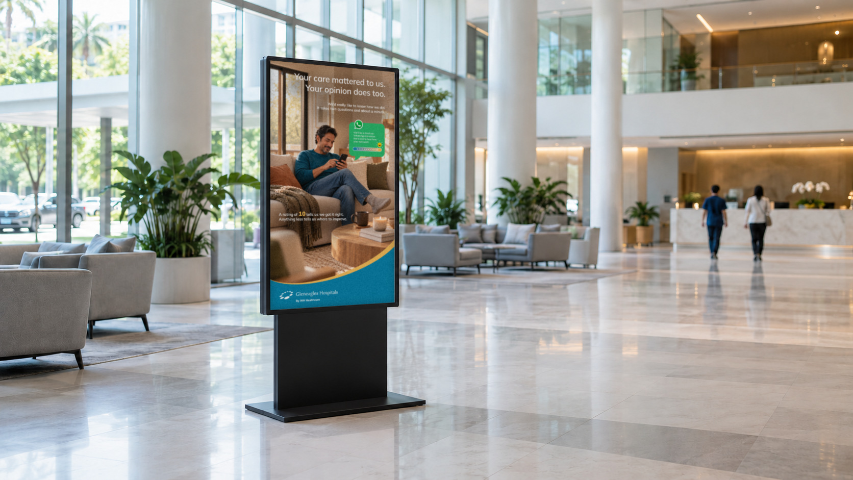
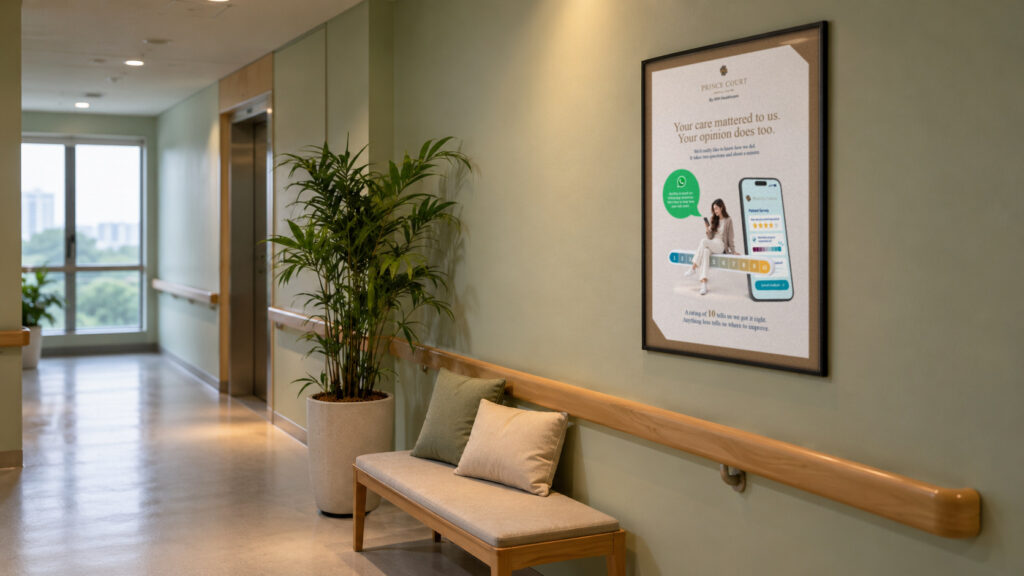
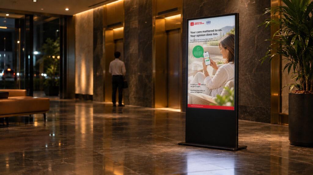
We wrote one set of words to suit IHH Malaysia’s voice: warm, simple and quick to read. “Your care mattered to us. Your opinion does too.” Below it, the artwork explains that the survey has two questions and takes about a minute, and a WhatsApp bubble says the hospital will be in touch tomorrow. Every hospital carries the same words, so a patient hears the same thing wherever they visit.
A different look for each hospital
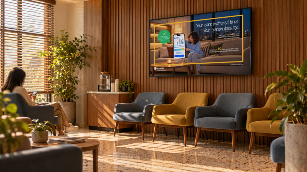
Each of the five hospital brands has its own brand image, so we proposed a visual direction for each one. Gleneagles Hospitals sits in a sunlit living room with its blue and gold. Island Hospital kept its leaf pattern and its “To Comfort Always” line. The Pantai Hospitals horizontal screen is a warm evening at home with a city view, framed in yellow. Prince Court Medical Centre went refined, in soft beige and bronze. Timberland Medical Centre got a bright, open terrace in its red.

New people on every piece
Each poster and screen shows a different person, in a realistic photographic style. We didn’t want one image repeated across every piece, and a mix of ages, men and women says something the words don’t: the hospitals care for all kinds of people. Most of them are relaxed at home with a phone in hand, which is the moment the survey actually lands. Every design ends on the same line: a rating of 10 tells us we got it right, and anything less tells us where to improve. Patients know what the scale means before the message arrives.
One patient feedback message runs across all five hospital brands. Each hospital has its own look and its own people, so every patient sees their own hospital in it.
Danny
What went out
The posters and screens went out for all five hospital brands across Malaysia. Everything went to the client smoothly, and the team at IHH Malaysia was happy with the result.
If you’d like to see more, there’s Generations of Care, a film we made with IHH, or a look at what we do.